
Mapping Political Violence in Africa (2021–2024)
🌍 Mapping Political Violence in Africa: Insights from ACLED Data (2021–2024)
This project visualizes political violence events across Africa using the rich, georeferenced dataset from the Armed Conflict Location & Event Data Project (ACLED).
I created two main maps:
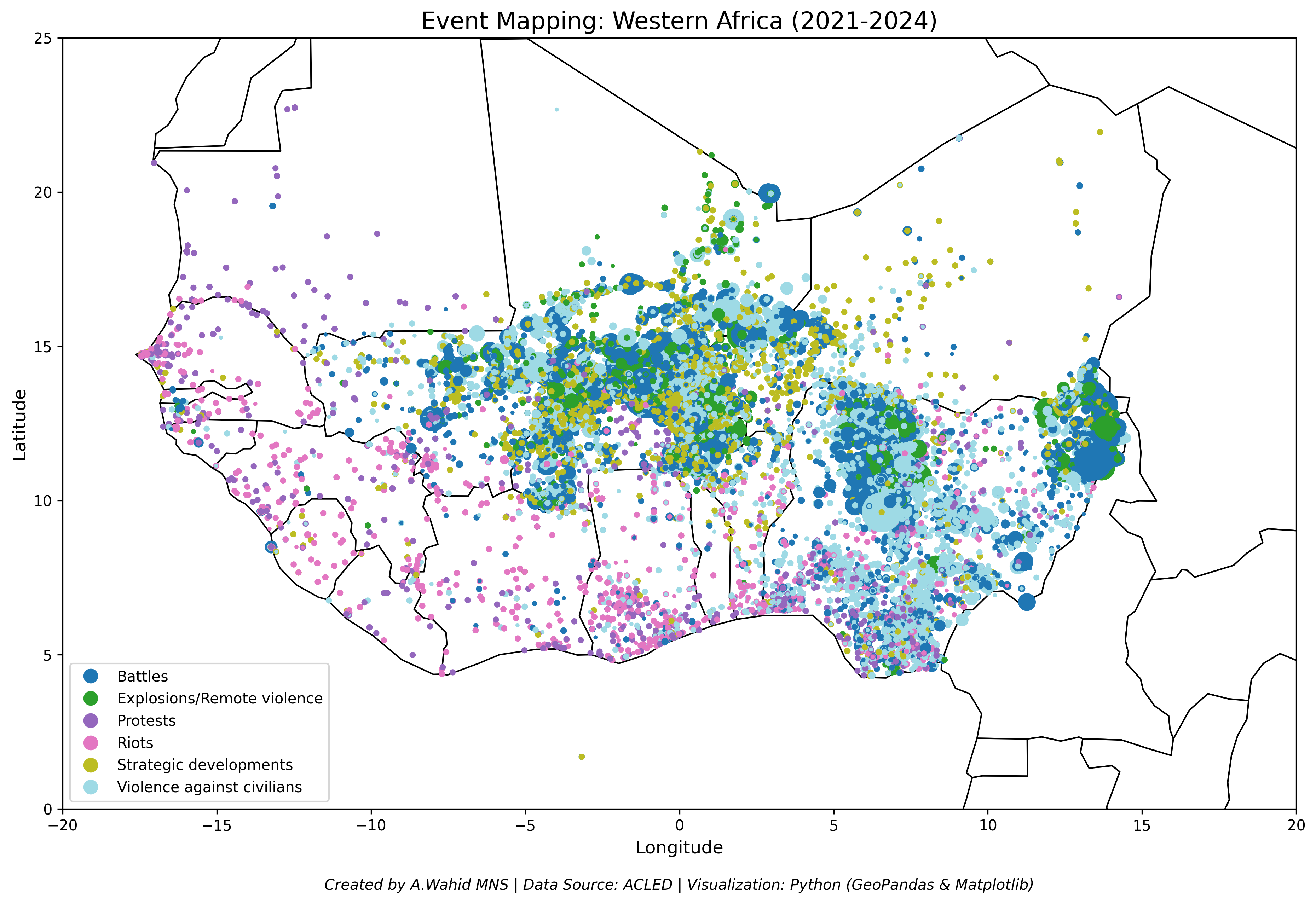
- Event Mapping in West Africa (2021–2024) – showing the spatial distribution of different types of political violence.
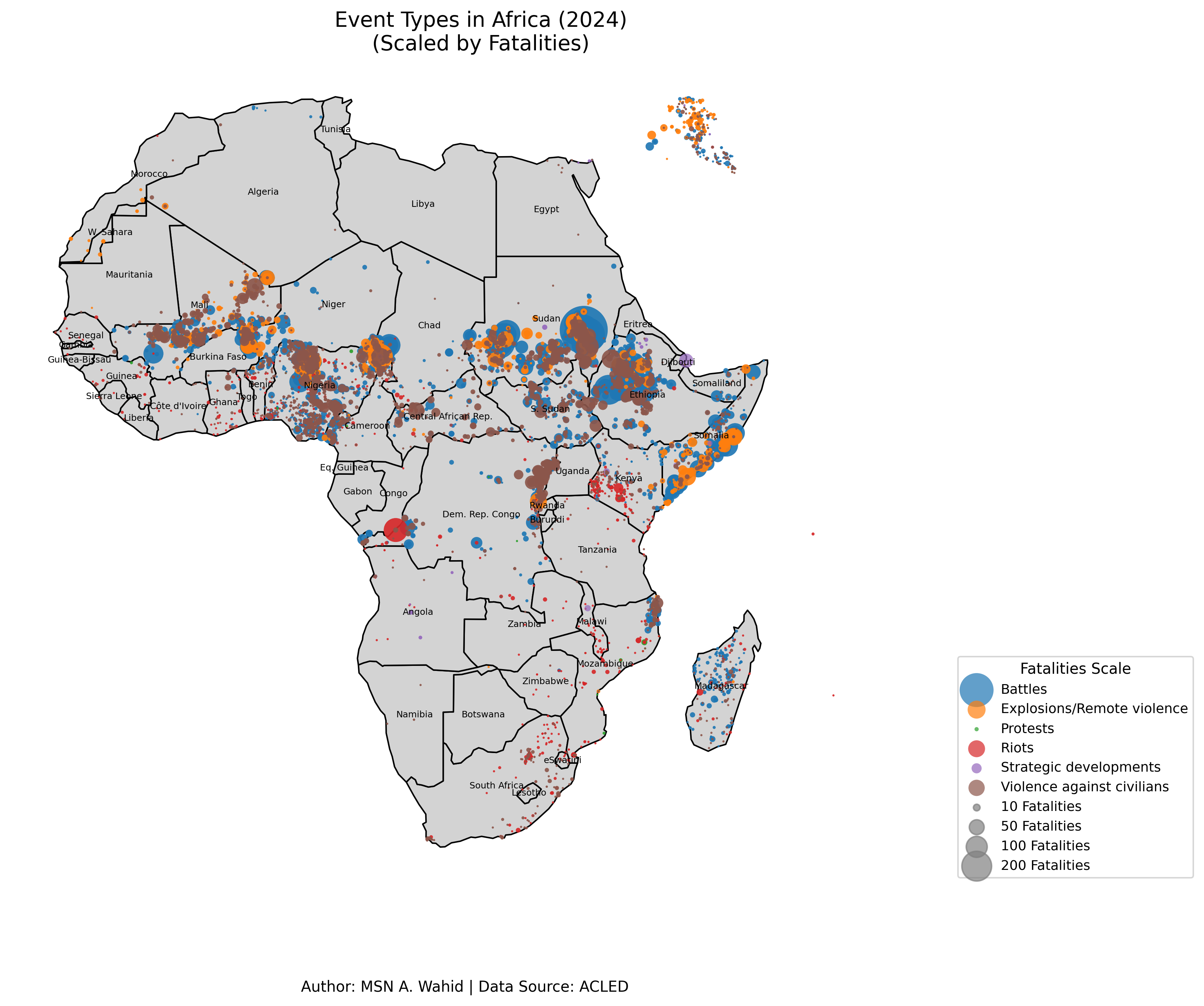
- Africa-Wide Event Mapping (2024) – scaling event markers by the number of reported fatalities to highlight areas of concentrated impact.
🗺️ Key Visualizations
Western Africa: Event Types (2021–2024)
Africa (2024): Event Types Scaled by Fatalities
📌 What These Maps Show
- Types of Events: Battles, explosions/remote violence, protests, riots, strategic developments, and violence against civilians.
- Fatalities Scale: Bubble size reflects the number of fatalities (e.g., 10, 50, 100, 200+).
- Conflict Hotspots: The Sahel region, northeastern Nigeria, Ethiopia, and Sudan emerge as major areas of concern.
🧰 Tools Used
Python- Libraries:
GeoPandas,Matplotlib,Pandas
🔍 Why It Matters
Understanding the geographic spread and intensity of political violence is crucial for:
- Policy makers
- Humanitarian organizations
- Conflict researchers
These visualizations provide a data-driven foundation for risk analysis, peacebuilding efforts, and strategic decision-making.
💬 Let’s Connect
Have feedback or want to collaborate?
Let’s explore how visual analytics like this can support smarter conflict monitoring and policy solutions.
📊 Tags
#DataVisualization, #ConflictAnalysis, #Africa, #PoliticalViolence, #ACLED, #Geopolitics, #Python, #Mapping, #PolicyResearch