
Multidimensional Poverty Comparison in Africa (2011 vs 2018)
📊 Tracking Multidimensional Poverty in Africa
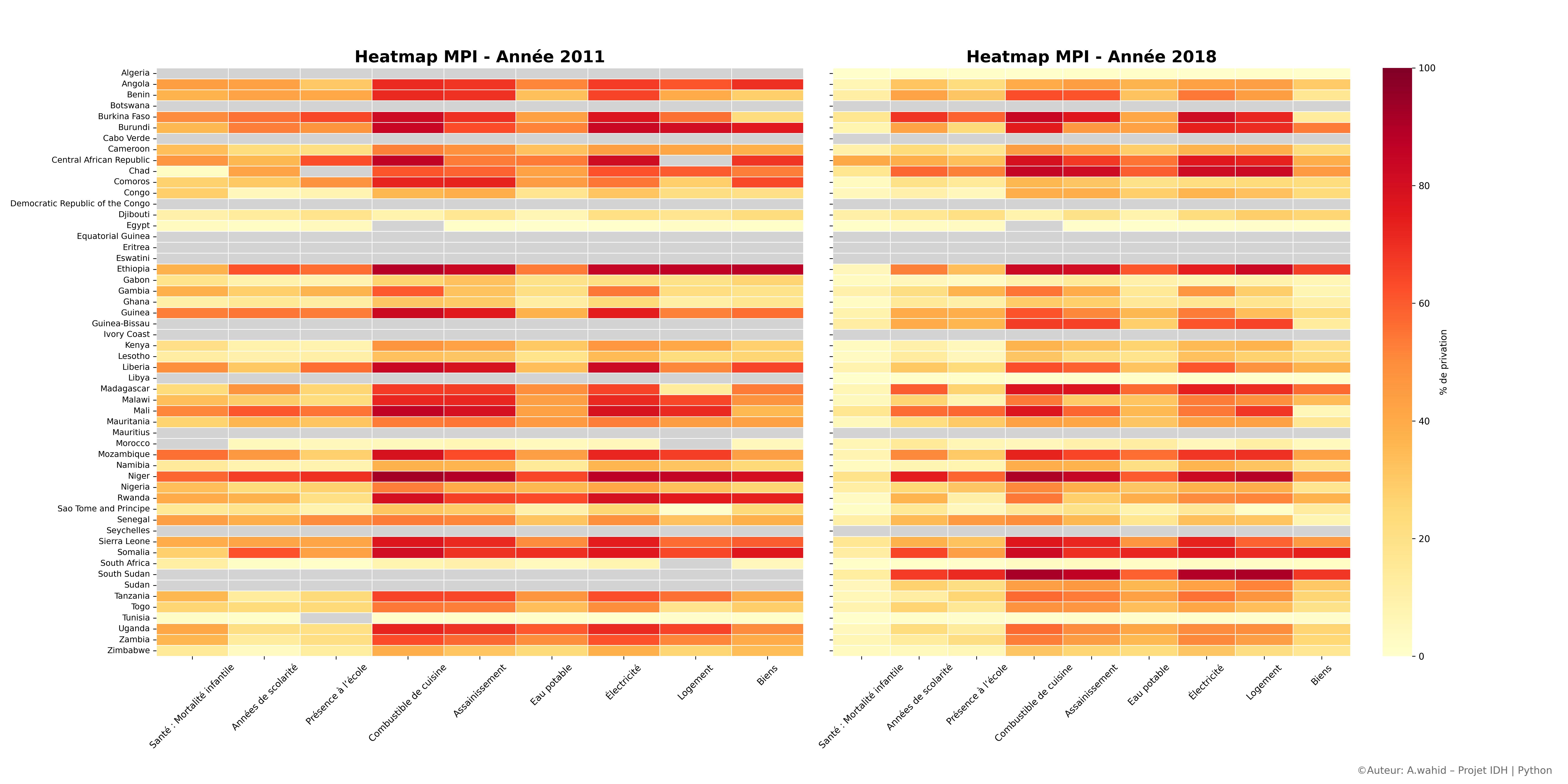
This visualization compares deprivations (in % of the population) across 9 essential dimensions between 2011 and 2018, using data from the Global MPI (OPHI – Oxford).
🗝️ Dimensions Covered:
- Child Mortality
- Years of Schooling
- School Attendance
- Cooking Fuel
- Sanitation
- Drinking Water
- Electricity
- Housing
- Assets
✅ Key Findings
- Notable improvements in access to electricity, education, and household assets in many countries.
- However, persistent or stagnant deprivation remains in critical areas like housing and safe drinking water in others.
- The map provides a powerful snapshot of country-level progress, though inter-country comparisons should be made cautiously due to context-specific factors.
🧰 Tools Used
- Data: Global MPI – Oxford Poverty and Human Development Initiative (OPHI)
- Visualization:
Python,Seaborn,Matplotlib
📷 Visualization
🏷️ Tags
#DataForDevelopment, #MPI, #Africa, #DataScience, #Python, #GlobalMPI, #OPHI, #DevelopmentEconomics, #PovertyMapping, #IDH, #DataViz