🔍 One of the major goals of housing analysis is to understand how rental markets vary across regions and over time.
🧭 Objective
Provide an interactive, province-level view of rental market indicators to better track affordability and dynamics across Canada.
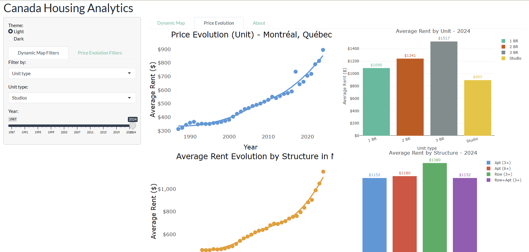
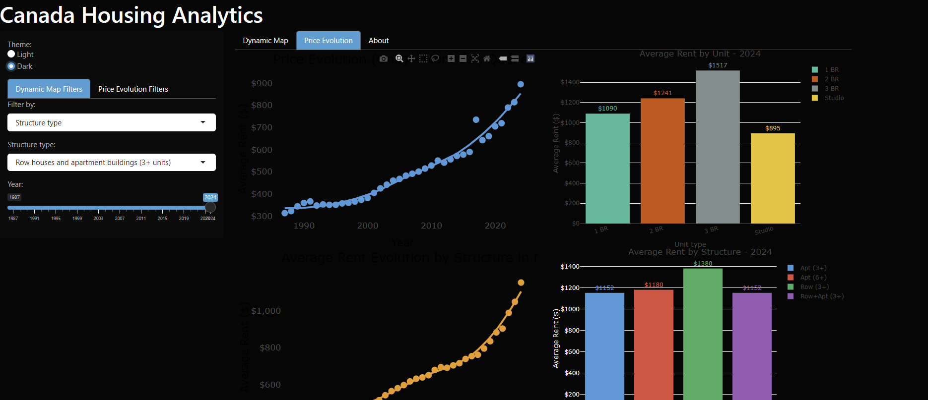
📊 Visualizations
🧰 What the dashboard does
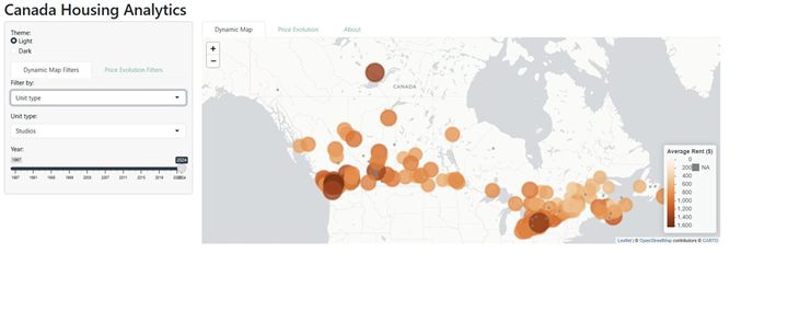
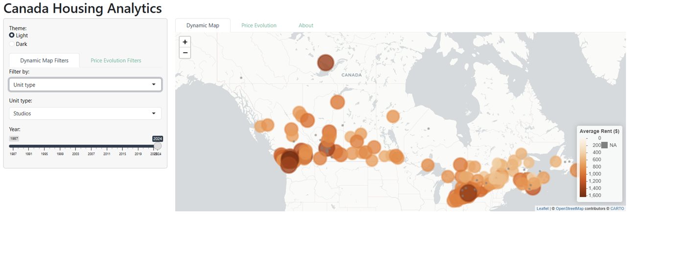
- Rent trends over time and space: follow how average rents move across years and regions, rather than reading a single snapshot.
- Interactive maps with dynamic filtering: narrow the view down to the geography that matters to you.
- Breakdown by structure type: apartment buildings, row houses, and other dwelling categories.
- Breakdown by unit type: bachelor/studio, one-bedroom, two-bedroom and three-bedroom units, so comparisons stay like-for-like.
- Downloadable tables behind every chart.
📚 Data & tools
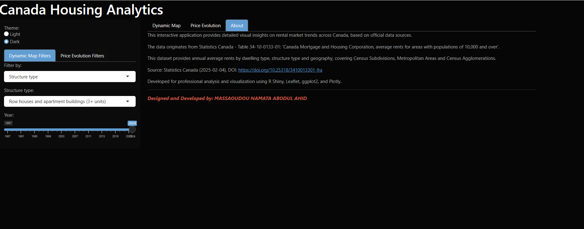
- Source: Statistics Canada: official rental and housing indicators
- Period: 2023–2025 (rolling updates)
- Tools: R, Shiny,
tidyverse,plotly,DT
🎯 Who it is for
Built to serve several audiences at once:
- Market research: compare rent levels and dynamics across provinces and dwelling types
- Economic monitoring: track affordability pressure as it develops
- Public policy: help identify high-pressure rental areas
- Urban studies: read rental structure alongside geography
- Real estate investment: situate a market against national trends
- Students and households simply comparing rents before a move
📱 A note on mobile
The dashboard packs a map, filters and tables side by side. On a smartphone, turn the device to landscape: the layout has far more room to breathe.
💬 Feedback
Remarks, suggestions and ideas for improvement are always welcome: they are what makes the next version better.
🗓 Completion
June 2025